


The project
Sabine Albers was already a busy photographer and had previously travelled the world working on incredible photography projects. But she was lacking the visibility with big creative agencies in Australia, and had mountains of unused potential.
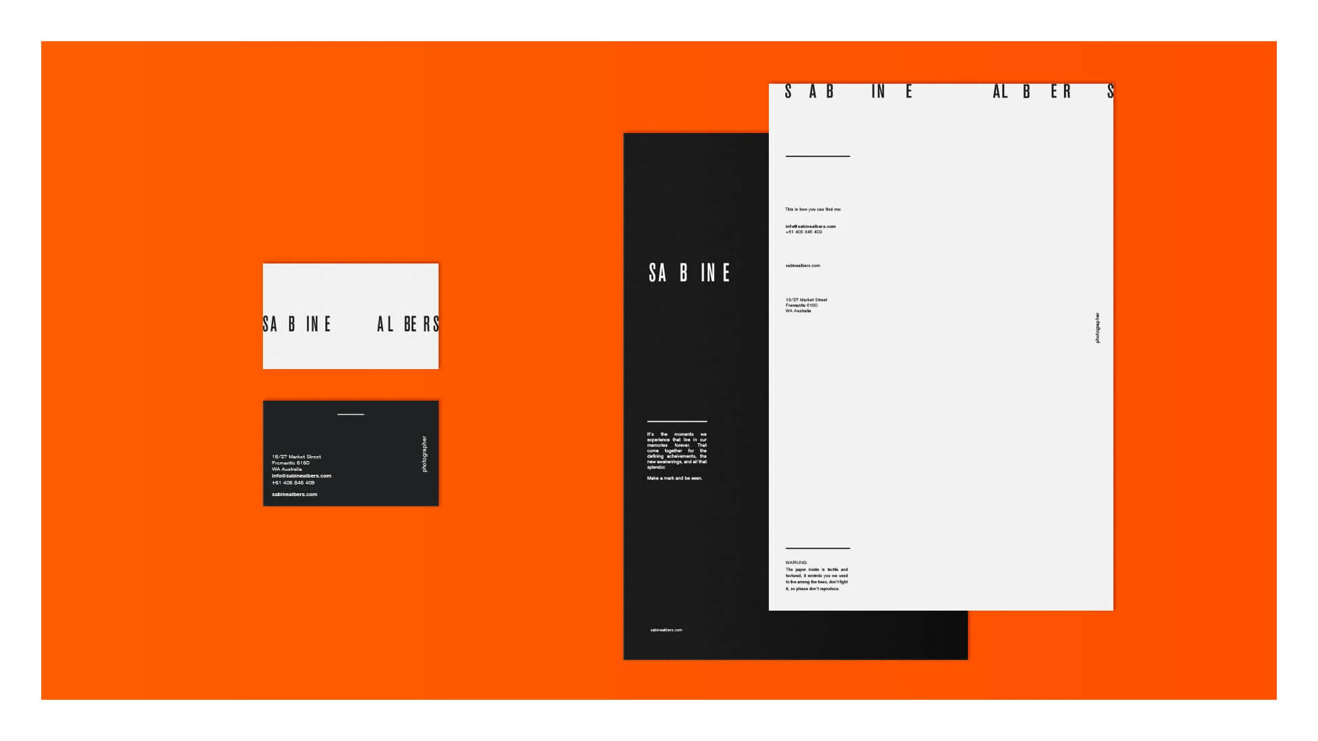
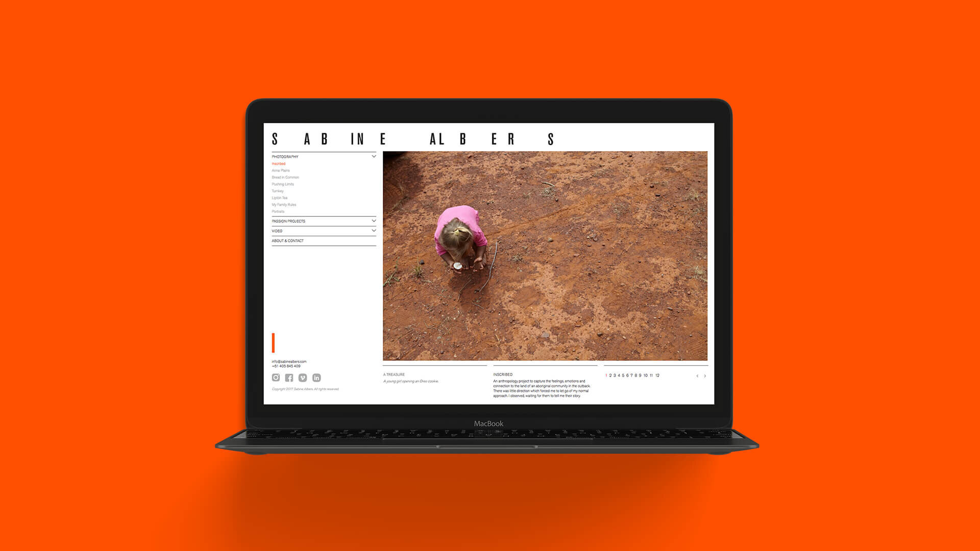
Sabine needed a strong brand identity and distinct industry positioning. A brand that would make Creative Directors and agencies take note. A brand that would take her to a new level in Australia. .
Solution
With a focus on the future and where a brand could live and thrive, we created a flexible brand system that could grow and change in response to a new and changing world of education.
We imagined a world where discovery, and exploration wasn’t the stuff of legend, where communication to the far reaches of the globe was instantaneous, where just about anything could be learned from just about anywhere… this is the Torrens promise.
This story became the inspiration for a flexible identity system that harnessed emotive imagery and messaging, clean lines, bright colours and interesting typographic arrangements. Embellishments of intellectually interesting design motifs that inspire collaboration. No pillars, crests or old serif typefaces.
The brand was designed to be handled by multiple departments, not just the marketing department and other designers. With a focus on function, we tested the brand so it could bend, morph and adapt to all communications - internal, external or online.